Optimal Lotion Packaging Solutions For Different Skincare Product Lines
Why must emulsion packaging strategies be tailored to different product categories?
Before delving into specific product categories, it is necessary to clarify why "differentiated packaging" itself is so important.
Every lotion packaging decision should be shaped by three core driving factors.
First, there's the issue of frequency and dosage. Facial moisturizer, applied in small amounts twice daily (morning and evening), and body lotion, applied in large quantities after each shower, have drastically different requirements in terms of dispensing. The former demands precise dispensing and hygienic protection, while the latter requires efficient dispensing and durability. Forcing both products into the same container format is a compromise that benefits neither.
Secondly, there's the usage scenario. Where consumers use the product directly determines the physical conditions the packaging needs to withstand. Products on bathroom shelves face moisture, accidental drops, and handling with wet hands; products in handbags must be compact, leak-proof, and shock-resistant; products in clinical or hospital settings must immediately convey safety and compliance. Packaging that ignores the usage environment creates friction in the consumer experience-and friction is the biggest killer of repeat purchase intentions.
Thirdly, there's brand image and sales channels. The expectations for materials in a luxury facial serum sold in a department store are vastly different from those for a mass-market body lotion on a pharmacy shelf. Similarly, the visual language of men's grooming products positioned on DTC websites is completely different from that of baby skincare products in pediatric pharmacies. Channel requirements-from retail buyer specifications to e-commerce shipping standards-impose real constraints on packaging, which no design creativity can circumvent.
The costs of ignoring these driving factors go far beyond theoretical considerations. Glass-jarred body lotions pose real safety risks when used in the bathroom; dark, angular baby skincare products struggle to meet the emotional purchasing logic of parents; and poorly sealed travel-sized lotions generate negative reviews that no marketing budget can fully compensate for. Packaging misalignment is not merely an aesthetic issue; it directly impacts sales volume, return rates, and the accumulation of long-term brand equity.
Facial lotion and day/night moisturizer
Facial care is the most emotionally driven and functionally demanding category within the entire lotion product line . Consumers who consistently use facial moisturizers daily are making a thoughtful, ritualistic commitment to their skin. The packaging must live up to this commitment.
The core packaging demands of this product category focus on three points: formula integrity, hygiene protection, and premium presentation. Facial lotions containing active ingredients such as retinol, vitamin C, or peptides are extremely sensitive to air and light. Every time a consumer opens the jar or puts their fingers into the product, bacteria are introduced, accelerating the oxidation process. Airless pump bottles elegantly solve this problem. By maintaining a sealed vacuum environment, it protects the formula, extends shelf life, and provides a consistent dispensing rate with each pump. For brands investing in high-performance skincare formulas, airless pump bottles are not a luxury, but a functional necessity.
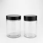
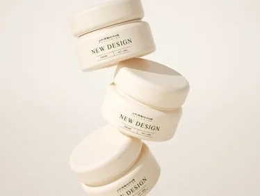
For thick, creamy night creams and repair creams where pump dispensers are impractical, low-profile glass jars with inner seals remain the preferred option. The inner seal creates a hygienic barrier upon first opening, conveying the product's integrity to the consumer-a moment with significant brand perception impact.
In this category, the choice of materials and processes carries significant weight in brand communication. Frosted glass conveys a sense of clinical efficacy and a high-end positioning; the matte tactile coating on plastic components replicates the tactile experience of glass without increasing its brittleness or weight; the metallic pump head and neck ring give the product a jewelry-like texture, resonating strongly in department stores and professional beauty channels.


Body lotion and full-body moisturizing products
Body lotion represents the epitome of practicality in the lotion category. With high purchase volumes, generous usage, and practical rather than ritualistic applications, the primary focus of body care packaging is functionality, durability, and cost control, rather than aesthetic expression.
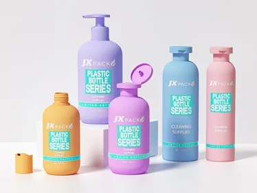
For this reason, the standard form for this product category is the pump bottle, typically made of PETG or polypropylene (PP), with a capacity between 200ml and 500ml. PETG has high transparency, making it easy for consumers to see the remaining amount, while also possessing the drop resistance and moisture resistance necessary for bathroom shelf use. PP material has similar durability but is less expensive, making it the default choice for mass-market body care products. Both materials are compatible with standard lotion pump heads, supporting high-capacity filling line operations.
In humid environments, pump bottles offer an additional advantage over tubular and canned bottles: they dispense water vertically with one hand, eliminating the need for screwing on caps or using both hands to squeeze. This small convenience silently builds positive brand associations with each use.
for body lotion packaging lies in shelf differentiation. Due to intense competition and price sensitivity in the body care category, many brands default to using nearly identical cylindrical pump bottles, relying primarily on label design to differentiate themselves. However, brands that invest in bottle design-expanded bottoms, tapered silhouettes, and asymmetrical shapes-often achieve far above-average shelf recognition with relatively limited mold investment. Color-coded pump heads across product lines and the combination of matte and glossy finishes are low-cost methods to establish brand recognition without requiring a complete redesign.
Refill pouches represent a continued growth opportunity in the premium body care category. As sustainability becomes a key factor in the purchasing decisions of some consumers, offering concentrated refills at a lower unit price serves both the environmental narrative and strengthens customer retention goals.



Hand cream and topical care products
Hand cream occupies a unique position within the lotion category. It's both an everyday functional product and one of the highest-converting gift items in the entire beauty market. Packaging strategies must serve both roles simultaneously, without neglecting either.
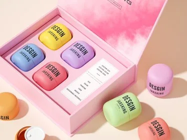
Portability is paramount. A hand cream that can't fit in a coat pocket, handbag, or desk drawer will be used much less frequently, thus weakening customer loyalty and repeat purchase signals. This is why slim tubes-whether aluminum, composite, or soft plastic-are the dominant form in this category. They are lightweight, flexible, and offer a high degree of customization in terms of surface finish.
For brands positioned as high-end and premium, the 30ml mini glass jar adds a sense of collectability and gift-giving that tube packaging cannot replicate. The trade-off is reduced portability and convenience: the glass jar requires two hands to open, and repeated finger rinsing raises hygiene concerns. For brands whose primary use is for display and gifting, this trade-off is acceptable. However, it is not suitable for brands whose core consumer behavior revolves around portability.
The gift-giving aspect of hand cream deserves special emphasis. Gift sets built around hand cream SKUs are one of the most stable product formats in high-end beauty retail. Therefore, the packaging of hand cream should incorporate the presentation of the set from the very beginning of the project: the tube or jar must visually echo other matching items within the gift box, fit neatly with the inner lining insert, and carry the brand's complete visual language in a small size.
Baby care lotion and sensitive skin repair products
Of all product categories, none places a higher demand on packaging to "convey trust" than baby care. When a parent chooses lotion for their baby, or a consumer selects a repair product for damaged, sensitive skin, the purchase decision is driven more by instinctive emotional signals than by product ingredient statements. Packaging must pass the test of emotional credibility before the consumer reads a single line of text.
The visual language of this category is dominated by "softness." Rounded shapes, white or soft color schemes, matte finishes, and clear, legible typography subconsciously convey a sense of "gentleness," "safety," and "trustworthiness." Sharp-edged shapes, dark colors, metallic finishes, and intricate decorative patterns, on the other hand, convey the opposite message-even with thoroughly clinically validated formulas, this visual deficiency cannot be compensated for.
Material safety must be clearly communicated, not assumed to be known by the consumer. BPA-free and phthalate-free material certifications should be prominently displayed on packaging without being cluttered. Overly piling on claims will undermine the simple, credible visual language upon which this category is built. The required design restraint is quite high: you must convey a sense of security without inducing anxiety.
For sensitive skin repair products positioned in pharmacy channels, the visual message has shifted from "gentle care" to "clean clinical." White packaging, precise sans-serif typography, and restrained use of color convey a dermatologist-grade level of professional credibility. The product's appearance must evoke the feeling of being next to a prescription drug shelf, rather than in the lifestyle moisturizer section.
This product category should minimize manual handling during dispensing. Soft LDPE squeeze bottles with controlled-flow outlets allow caregivers to dispense precise amounts with one hand while simultaneously attending to an infant. Pump bottles with locking mechanisms prevent accidental dispensing during travel. These features are not added later-they are the core of what earns five-star reviews and positive caregiver feedback.
Travel-sized and mini-sized products
Travel-size packaging may seem simple , but its complexity far exceeds its appearance. Format constraints are absolute-TSA compliance requires containers to be no larger than 100ml-while consumer expectations are disproportionately high compared to the product size. If a travel-size lotion leaks, is difficult to open, or gives the impression of being a downgrade from the full-size product, the resulting damage to brand image is something no email marketing campaign can fully repair.
The primary engineering consideration is leak-proof sealing performance. This product category cannot rely on ordinary flip-top or screw caps. Travel-sized products must withstand pressure changes, inverted placement, and rough handling during packing-conditions rarely encountered by standard packaging. Torque-tested seals, built-in sealing films, and pump-head locking mechanisms offer a clear return on investment in leak-proof packaging compared to unit cost.
The primary visual objective is a faithful, miniature reproduction of the full-size product. Travel-size products should convey to consumers a precise replication of the full-size product-the same bottle proportions, the same color scheme, and the same material and craftsmanship. When consumers pick up the travel-size as a sample and recognize it as belonging to their desired high-end product line, the conversion path to the full-size product is significantly shortened. Conversely, if the travel-size's appearance and texture resemble a regular free gift, this conversion path essentially disappears.
The strategic value of travel-sized products beyond "trial use" should not be overlooked. QR codes printed directly on the bottle or included with the product card, linking to the full product line, loyalty program, or brand content, are a high-value conversion and value-added method that most brands have not yet fully utilized.
Men's grooming lotion and after-shave products
Men's grooming is one of the fastest-growing segments in the personal care market, and its packaging logic has a distinct and independent system. Male consumers' relationship with skincare products is generally more functional than ritualistic than that of female consumers. Packaging must reflect this reality truthfully, rather than pandering to it, and certainly not condescendingly "educate" this group.
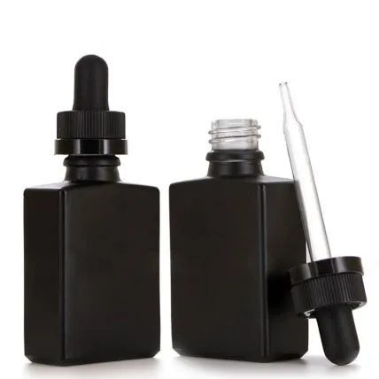
The visual language of men's grooming packaging is built on simplicity, strength, and credible materials. Matte black, deep navy blue, charcoal gray, and gunmetal gray are the dominant color schemes-not because of industry convention, but because these color palettes convey seriousness, efficiency, and confidence, which are precisely the emotional values that men's grooming consumers resonate with. Soft tones, floral illustrations, and decorative patterns that excel in women's skincare products intentionally diminish brand credibility in this category.
Typography plays a particularly important role in men's grooming packaging design. Large, clear brand names and direct claims of efficacy-"24-hour deep hydration," "after-shave care," "daily anti-aging"-convey product functions without requiring consumers to read carefully. This directness is a design advantage, not a limitation; it accurately reflects how male consumers make purchasing decisions.
In this category, pump bottles have a significant preference advantage over cans. The convenience of one-handed dispensing offered by pump bottles aligns with the efficiency-first behavior of most male grooming consumers; at the same time, it also avoids the hygiene concerns of many male consumers-whether rational or not-regarding open-can products.
High-end men's product lines can leverage premium materials and details to enhance perceived value: brushed aluminum pump heads, rubberized matte finishes, and weighted bases for added weight and tactile feel. These details are particularly effective in direct-to-consumer (DTC) and specialty retail environments, where consumers have ample time to interact with the product. However, in mass-market retail channels, a clean and simple shelf presentation takes precedence over the perceived premium feel of materials.


Strategic Framework for Packaging Decisions
After examining the packaging logic of each product category, these insights can be integrated into a five-step decision-making framework applicable to all lotion product lines. The core value of this framework lies in its requirement that brands answer fundamental questions about the nature of their products before making any visual or material decisions.
Step 1: First define the use case, then choose the packaging format.
This is the starting point of the entire decision-making chain, and also the most frequently skipped step. Brands often start directly with "What kind of bottle do I want?" instead of "In what circumstances will consumers use this product?"
The core questions that need to be answered include: Where does the consumer use this product-in the bathroom, bedroom, at their desk, outdoors, or while traveling? Are their hands dry or damp when using it? Is it used once or multiple times a day, or as needed? Is the amount used precisely in small amounts each time, or is it applied over a large area? Is the product for personal use or for family sharing?
The answers to these questions immediately generate practical instructions at the packaging level. For example: high-frequency bathroom use → drop-resistant and shock-resistant materials are preferred; one-handed operation with wet hands → flip-top or pump head is better than screw cap; precise small-volume use → airless pump or metered outlet is better than large-diameter open containers; large capacity for family use → pump bottle is better than squeeze tube. If this step is skipped, all subsequent decisions are like building a house without a foundation.
Step 2: Identify the specific constraints of the sales channels
Different sales channels have packaging requirements that go far beyond just "looking good." Each channel has its own unspoken rules, and brands that don't understand these rules often pay the price during supply negotiations or when the product is put on the shelves.
Offline retail (supermarkets, department stores, pharmacies): Retail buyers typically have specific requirements for shelf space width, maximum bottle height, barcode placement, and packaging bottom stability. Large chain retailers, in particular, may require products to pass specific drop and stacking tests before they are allowed to be placed on shelves.
E-commerce (self-operated websites, third-party platforms): Transportation vibration, package compression, and air pressure changes are the core physical challenges faced by e-commerce packaging. The sealing performance, pump head locking mechanism, and outer packaging cushioning design directly determine the arrival integrity rate, which in turn directly affects the negative review rate and return costs.
Travel retail (airports, duty-free shops): The volume must not exceed 100ml, and the TSA compliance statement must be clearly displayed on the packaging. Consumers in this channel have extremely short decision-making times; the packaging must convey the brand's prestige and the product's purpose within three seconds.
For gift channels (holiday gift boxes, corporate gifts): Packaging must look good in photos, coordinate visually with other items in the set, and fit the fixed structure of the gift box lining. A bottle that cannot stand stably in the gift box or does not photograph well will be immediately rejected by the gift purchaser.
Completing a preliminary assessment of channel constraints before finalizing the packaging structure can effectively avoid costly redesigns later on.
Step 3: Establish brand tone and hierarchy
Packaging materials and craftsmanship are the most direct signals for consumers to predict the value of a product. The four levels of mass-market, mass-market premium, high-end, and luxury each carry the expectation system of materials and craftsmanship formed by consumers through long-term market education.
Mass-market segment: PP or HDPE bottle body, glossy label, standard pump head. Consumers expect practicality, clarity, and high recognizability, not so much sophistication.
Mass-market premium level: PETG bottle, matte or semi-matte coating, lightweight metallic components. Consumers are willing to pay a premium for an experience that is "slightly better than everyday items," and the packaging needs to convey this distinction.
Premium level: Glass or thick-walled PETG, matte finish, electroplated or aluminum pump head, hot stamping or laser engraving. Consumers will touch and visually inspect the packaging before purchasing; it must pass both of these checks.
Luxury Tier: All-glass or metal bottle, handcrafted assembly details, personalized embossing or engraving, and exquisite outer packaging. Consumers are not just buying a product, but a status symbol and a collectible item.
Over-promising-using luxurious materials on mass-market products-creates a trust gap at the point of purchase, leading to a perception of "not being worth the price." Under-promoting-using utilitarian packaging on high-end products-destroys perceived value before the formula even has a chance to demonstrate its effectiveness. Both of these missteps result in a simultaneous decline in conversion and repurchase rates.
Step 4: First determine the shape, then refine it.
This step is the one most often executed in reverse order in the entire framework. The correct order is: first, determine the type of mechanism (pump head, flip cap, airless pump, extrusion port) and container shape (bottle, tube, can) based on the conclusions of the first three steps, and then apply visual design-color scheme, font, graphic elements, and surface finish-on the determined structure.
Reversing this order means first having the visual preconceived notion of "I want a black frosted square glass bottle," and then working backward to find a dispensing mechanism to fit it. The result is often a product with an exquisite appearance, but inconsistent output, inconvenience for consumers, or low production yield. Form follows function, and aesthetics follows form-this is the most basic yet often overlooked logical sequence in packaging development.
Step 5: Assess the feasibility of production and logistics
The final step is to translate the decisions made in the first four steps into an actionable production plan. This requires a systematic review of the following dimensions:
Minimum Order Quantity (MOQ) Compatibility: Are there any stock molds available for the selected containers? If custom molds are required, will the production volume cover the mold cost?
Filling line compatibility: Are the bottle neck specifications, pump head stroke, and neck outer diameter compatible with the filling equipment of existing or partner factories? Incompatibility means additional equipment commissioning costs or the risk of switching factories.
Transportation and drop testing: Has the packaging passed the ISTA or ASTM transportation simulation test standards? Especially for glass bottles and products with pump heads, the failure rate of transportation drops directly translates into cargo damage costs.
Regulatory requirements of the target market: Entering the EU market requires compliance with EU cosmetic regulations on packaging materials; entering the US market requires consideration of FDA requirements on labeling content; entering specific Asian markets requires attention to local mandatory regulations on recycling symbols and material labeling.
Any packaging solution that falls short of the aforementioned practical conditions, no matter how rigorously it is derived in the first four steps, is not the correct solution that can ultimately be implemented. Production feasibility is the floor of strategy, not its ceiling.